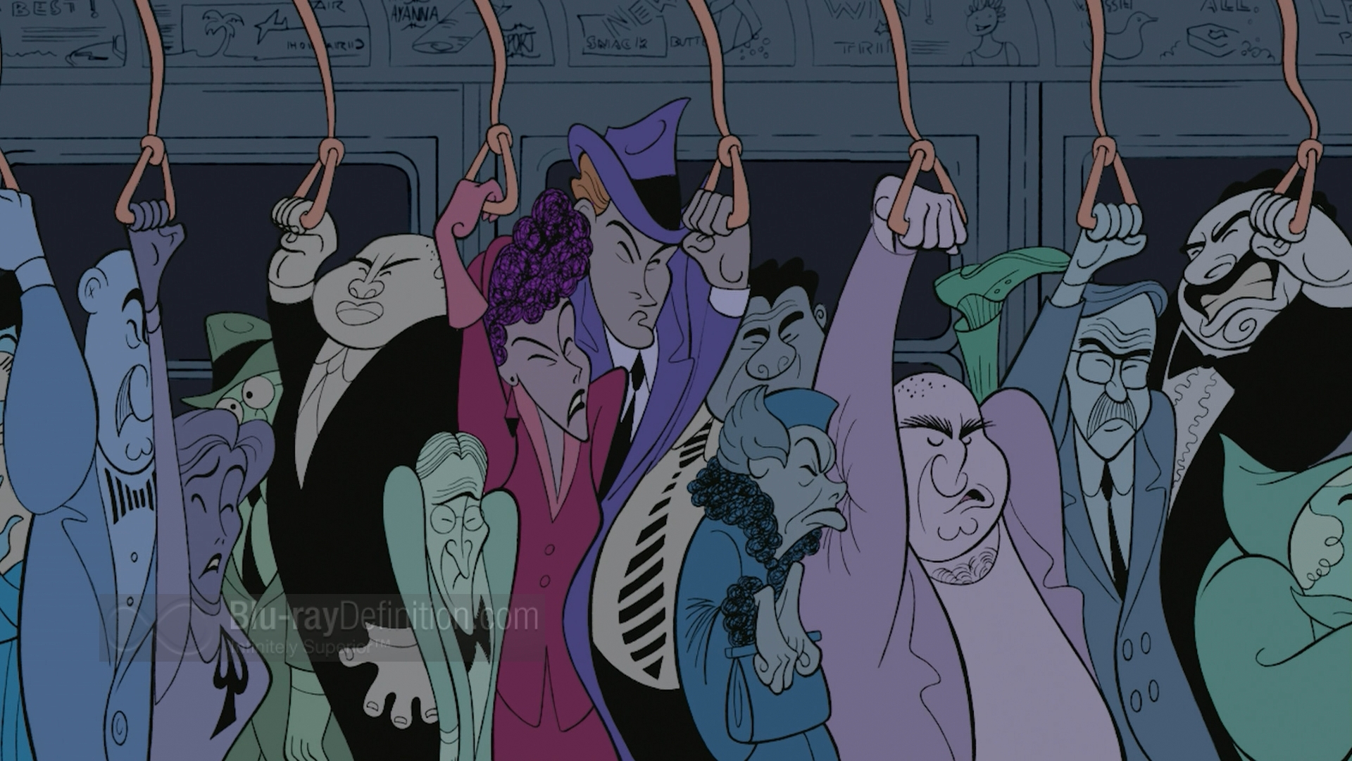
Anyways, here's my thoughts on these three movies:
Fantasia 2000
I suppose this movie could technically be referred to as a a sequel. However, since it was Mr. Disney's original intention that Fantasia be a rotating piece of work to be added to consistently so that every time you went to see it it was like seeing a different movie, I don't think it can rightly be called a sequel, but more like a fulfillment of Walt's original idea.
So I'm going to write this out the same way I did when writing my post on Fantasia. That is, one short at a time. Starting with Symphony No. 5 by Mr. Beethoven. This is sort of the token "music for the sake of music" piece to get the party started similar to the Toccata and Fugue that starts off Fantasia. Only this one tells more of a story than that one. Albeit a conceptual story, but a story nonetheless. I'm actually grateful for some sort of plot line; it makes it easier to focus on what's happening on screen than being nauseous and confused like I was when watching Toccata.
The only thing I have to say about the Pines of Rome sequence is I wish I was in the meeting where someone said "What about flying whales?" And everyone was ok with it. Because how this concept actually made it on screen seems a little far fetched to me. I don't think it's bad per se, it's just such a unique idea that I have a hard time thinking that the higher ups didn't need some serious convincing in order to get this okayed.
Rhapsody in Blue is seriously one of the best things to happen in animation history. Al Hirschfeld is AmAzing! The fact that an entire sequence is made in his style makes me feel like there's hope in the world of illustration. And boy does it make for good watching! What I love about this style is that it tells a whole story using only line. There isn't even a difference in line variation and color is almost irrelevant. I just like the idea that one line can communicate so much. It flows so well and is so....well, animated and free.

Piano Concerto No. 2 is just cute and has a splendid integration of traditional and computer animation. I think it may be the first sequence in Disney history where the characters are computer animated and the background is traditional. It actually works really well to make the toys appear real in a child-like environment.
The Carnival of the Animals, Finale is a giggly pot of joy and I love it. I love that it's a simple, fun concept using a simple, bright color scheme. It's basically like looking at a children's picture book only more awesome. I want to give a real flamingo a yo-yo and see what happens.
My opinions about The Sorcerer's Apprentice have not changed since the last time I blogged about it. You can find them here. I maintain that it is awesome.
Pomp and Circumstance is wonderful. I'm so happy to see Donald getting center stage. I've always liked him. I relate to him so well; he's that guy who probably always says the wrong thing in the wrong way at the wrong time and always overreacts, but he means well and sometimes he's mean, but not in a super malicious way (usually). Anyways...what I really like about this piece is that they take a well known piece of music that is associated with a very specific event and put it in an entirely different context. Thus breathing new life into it and making us see it in a different light. Just brilliant.
The Firebird Suite is stunning and makes for a good finale. I actually forgot what a huge influence this piece has been on my art style. I just love it. It's so fantastical. And for a girl who's a nerd for fairy tales this one just takes the cake. A+ work everyone!

Ok, that does it for Fantasia 2000. Let's move on to the other movies that came out during this year.
Dinosaur
Do you guys remember this movie? It's like Tarzan but with dinosaurs or The Land Before Time minus the star leaf.
Yeah...this movie looks like a photo manipulation. A very fancy photo manipulation, but a photo manipulation nonetheless. The animation is just not incorporated well enough into the background for it to read as believable. There are scenes where characters are walking and no dust puffs up as they move forward; it makes it look like the characters are walking above the ground and not on the ground. This animation is just off enough that it makes it uncomfortable to watch.
Oh, and here's something creepy:
The Emperor's New Groove
I have yet to meet a person who doesn't think this movie is hilarious and wonderful. I am, of course, one of them. There are so many fun nuances throughout this movie. Like how when Yzma throws her poisoned drink into the cactus behind her and it turns into a llama. Or when she's in the jungle being chased by bugs and Kronk is looking at exotic birds and the bugs morph into the shape of a shark as they chase her. Hilarious! I also counted 16ish llamas incorporated into the artwork throughout the movie (I kept loosing count while watching, thus the "ish"). Good times.
No comments:
Post a Comment